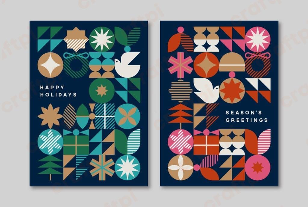
From responsive logos to dynamic illustrations, SVGs (Scalable Vector Graphics) have revolutionized the realm of web design. But what’s even more fascinating? The ability to style and animate these SVGs using simple CSS. Let’s dive deep into the vibrant world of Styling And Animating SVGs With CSS, where creativity knows no bounds!
Understanding SVGs: More Than Just Images

SVGs are XML-based vector images that can be scaled without loss of quality. Unlike raster images (like JPG or PNG), SVGs use mathematical equations to depict images, enabling them to retain crispness regardless of their size.
And here’s a chuckle for you – think of SVGs as the digital world’s version of a stretchy rubber band. It can expand or contract without ever snapping or losing its shape!
But, beyond their flexibility, SVGs have an ace up their sleeve – they can be manipulated using CSS, just like HTML elements. That’s where the magic begins!
The Basics: Styling SVGs With CSS
Styling SVGs is a breeze, especially if you’re already familiar with CSS. Once your SVG is embedded in HTML, you can target its elements (like
For instance, changing the fill color is as simple as:
    circle {
        fill: #3498db;
    }
You can also modify stroke width, stroke color, opacity, and more. With these basics at hand, creating a styled SVG is straightforward.
Animating SVGs: Bringing Them to Life
Animation can transform static SVGs into dynamic visuals. From simple hover effects to intricate animations, the possibilities are endless.
1. Simple Hover Effects
Let’s start with a basic hover effect to change the fill color:
    circle:hover {
        fill: #e74c3c;
    }
This CSS snippet will change the circle’s color when hovered over. But why stop there? Let’s dive deeper.
2. Transitions & Transformations
Combine CSS’s transition property with transformations for smoother and more diverse animations:
    path {
        transition: transform 0.3s ease;
    }
    path:hover {
        transform: scale(1.1);
    }
The above code enlarges the path element upon hover, creating a zooming effect.
3. Keyframes & Complex Animations
For more intricate animations, CSS keyframes are your best friend:
    @keyframes spin {
        from {
            transform: rotate(0deg);
        }
        to {
            transform: rotate(360deg);
        }
    }
    path {
        animation: spin 5s infinite linear;
    }
This code will make the path element spin indefinitely.
Pro Tip!

For smooth animations, use the browser’s GPU by incorporating translateZ(0) or will-change: transform. It can significantly boost performance, especially in intricate animations.
Pitfalls & Precautions
While SVGs are fantastic, they come with their quirks. Not all CSS properties work with SVGs, and browser support can sometimes be sketchy. Always test animations across different browsers and consider fallbacks for older browsers.
A Personal Note on SVGs
My journey with SVGs and CSS began years ago, with a simple logo animation. Since then, SVGs have transformed how I view web graphics. They’re not just images; they’re stories waiting to be told, art waiting to be exhibited. Every line, curve, and color can be tweaked and twirled, making web design a canvas of infinite possibilities. As you embark on your SVG journey, remember: there are no limits, only horizons to chase!


 No products in the cart.