Welcome back, dear crafters! Have you ever found yourself struggling with letter spacing in Cricut Design? Don’t worry; you’re not alone. Crafting impeccable text design can be as intricate as adjusting the typography of your favorite quote or the name on a birthday card. This article is here to guide you step by step, unraveling the mystery behind achieving optimal letter spacing for the most impactful text and maximum visual appeal.
Understanding Letter Spacing, Kerning, and Typography
When it comes to typography, letter spacing, often associated with character spacing or kerning, refers to the adjustment of space between characters in a piece of text. Proper letter spacing can enhance visual balance and aesthetics, providing optimal readability and a professional finish. In essence, it is one of the key design elements that give you greater creative control and design precision.
The Power of Spacing Options
Cricut Design offers several spacing options, from narrow spacing to wide spacing and uniform spacing. Narrow spacing gives a compact, cohesive look ideal for headlines or short text, while wide spacing can add an elegant touch to your designs. Uniform spacing ensures a consistent appearance across your text, enhancing design consistency.
Step-by-Step Tutorial to Adjust Letter Spacing
Here is a simple step-by-step guide to letter spacing techniques in Cricut Design:
Start with your text: Begin by typing your text into the Text box in Cricut Design.

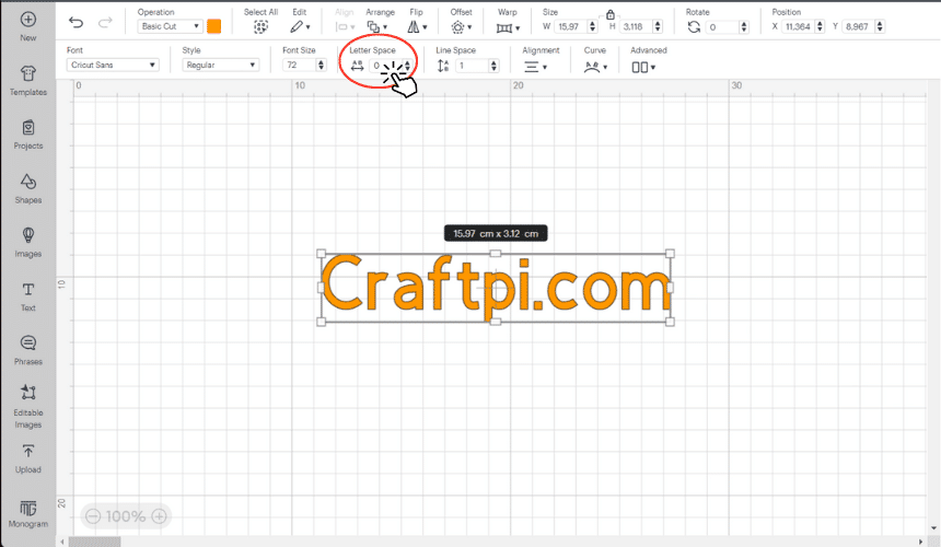
Adjust the letter spacing: On the top panel, you’ll find the Letter Spacing option. You can decrease the letter spacing for a tighter look or increase it for a more spread-out design.

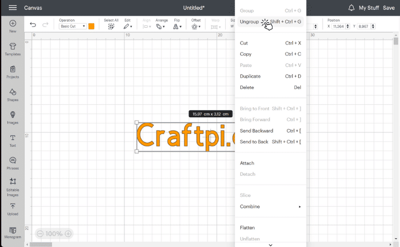
Manual adjustment: Sometimes, automated letter spacing doesn’t provide the desired effect, especially with certain fonts or special characters. In this case, ungroup your text and manually move each letter to achieve the perfect spacing.

Regroup: Once you’re satisfied, select all your letters and click ‘Group’ to treat them as a single unit for further manipulation.

Fine-tune your design: Experiment with different fonts, sizes, and alignments to achieve design refinement and design cohesion.
Final check: Always zoom out and view your design from a distance. This practice allows you to perceive the overall visual balance and make necessary adjustments.
The Power of Attention to Detail

The right letter spacing can have a significant impact on your design’s readability and appeal, serving as a testament to the timeless adage – ‘Details make perfection, and perfection is not a detail.’ Embrace the design versatility and the vast creative possibilities Cricut Design offers. With attention to detail, you can create truly captivating and personalized designs.
Conclusion
Mastering letter spacing might seem like a small thing, but as American author and motivational speaker, Zig Ziglar, once said, “Little things make big things happen.” As crafters, we understand this deeply. So keep experimenting, keep learning, and most importantly, keep creating!


 No products in the cart.